Week 13 Work In Progress
- Isabel Greene

- Apr 23, 2021
- 3 min read
As my dissertation was due this week and it was my primary focus I unfortunately did not get as much done with my project as I would have hoped. However to make up for this I will be working overtime this week to make up for time lost.
Card Design and Character Illustration
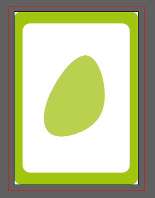
This week for the illustrations I focused on character and card design. I started working on the background designs for the front of the cards which can be seen here. From there I decided to move on to character designs - I started off with the Queen Medb character as I had the best idea of what I wanted the character to look like.


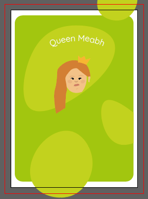
Once I had a better idea of the illustrations for this character I also played around with scale to see what it would look like with the characters being larger on the cards. You can see a more detailed post on the illustrations that I uploaded earlier this week.


I was a bit concerned that the illustrations might potentially be slightly too childish so I showed my illustrations to one of lecturers to get her feedback. She commented that she didn't think that the illustrations themselves were too childish but that potentially the type used did make it seem a bit childish - she likened it to kids book type, very legible. (This txt was just being used as filler). She recommended considering more organic typefaces and/or capitalising the text to make it seem more mature.
During this meeting, I also mentioned a concern I was having about making the 5 male characters in my deck look different enough from each other. I have 7 character cards in my game and 5 of them are men, considering the time that they are set in I am concerned that the individual characters won't look different enough from each other. Matching characters together in the game is a crucial mechanic so the characters must look different enough from each other so that they can be easily matched. My lecturer observed that it might be as easy as just giving the characters distinguishing features such as long beard, short beard, hair colour, hair length or different coloured clothes. She recommended making up very quick iterations of the characters with these different features. I'm hoping to have these finished by class next week so that I can get more feedback from my classmates and lecturers before teaching finishes at the end of next week.
Playful Typefaces
Based on the feedback I got from my lecturer, I had been trying out a couple of different sans serif playful typefaces but I wanted to try out some different ones. I found a great article showcasing 25 playful typefaces and decided to download and try a few. Below are some of the typefaces I tried out for my cards.


These are some of the examples which I feel work the best. However, they do all definitely bring a different vibe to the cards. The first example is Eckmann which comes off more mature and high class. The second example is Kind of Magic, which is whimsical and more informal. The third example is called LemonBird, which is slightly more mature than Kind of Magic, but also gives me kind of a Pinterest feel. I'm going to test out these different typefaces while designing the rest of my characters to see which fits best overall with the illustration and card aesthetic.


Print Research
As I talked about in last week's progress post, I planned to look closer at Galway printers to print my final cards. So during the week I did some research on Galway based printers and their capabilities.
Davitt Photo Printers
My local printers are the Davitt Photo Printers in Salthill. They are a small independent business and I had hoped that I would be able to support them. However, from what I can tell from their website they focus primarily on photography printing and photo gifts. I'm going to reach out and see if they would be able to print my work on non photo paper.
Blueprints Express
Blueprint Express are a company based in Liosban Industrial Estate that do printing, copying, laminating, binding and CAD service design and print. They can print colour prints on your choice of papers or card stock 80g to 350g and posters from A4 to A0 on a matt or gloss finish. As a plus they also have a 20% student discount.
Standard Printers
Standard printers are based on Ballybrit Industrial estate and have been in business for over 45 years. They offer services such as litho, digital and wide format printing. From what I can see from their website they also seem to have a quick turn around. I filled out a quote form on their website and am waiting to hear back.


Comments