Character Design Development Continued
- Isabel Greene

- May 4, 2021
- 7 min read
Cú Chulainn
The next part of designing Cú Chulainn was limbs and accessories. First I started with the feet and legs. This quite a bit more difficult than I had expected simplifying the feet shape whilst still having them look like feet was definitely something I ended up spending a lot of time on. I actually had more hastle with that than creating the sandals. I based the sandals off illustrations by Nicola Sedgwick for Declan Collinge's Fadó Irish Legend Series, which are have laces wrapped up to the knee.


From there I moved on to illustrating the spear, this took a bit of trial and error to decide on the spear head shape that I felt looked the most natural. I wasn't quite pleased with how the spear head seemed to just sit on top of the spear handle. After looking at some examples of old age spear heads I noticed that many of them were secured with some kind of rope or cloth so introduced this to the design and I feel it looks a lot more realistic. Under this I also added some bumps on the spear handle to mimic more of a natural organic shape.


I had been dreading the hands but although they took a bit of time they turned out to be a lot less stress than I was expecting. Since the fingers are the same colour and very close to the abs on Cú Chulainn's left hand I made sure to use different point sizes whilst drawing these so that there was clear distinction between these different body parts.


This is the final illustration of Cú Chulainn with his hound. I was slightly concerned that once I put the two together that they would not match up enough stylistically. However I was happily proven wrong as I feel the characters only stand to compliment eachother.


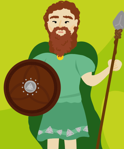
Ferdia
When creating the characters, I wanted to make sure that the characters that would be paired together within the game had similar visuals to aid in the matching and assocation of characters in the game. For this reason, Ferdia's body is directly based off of Cú Chulainn's. However, in order to give some distinction between characters I had decided previously that I would be adding a tshirt to his design.
To edit the appearance to look more like Ferdia, I first tackled the hair. As Ferdia's most common representations show him with long hair I wanted to also include that in my illustration of the character. It took quite a few turns to figure out the hair as it kept seeming like it was making the character look to girly. Once settling on the hair shape, I then made Ferdia's eyebrows a bit bushier and gave him a harsher jaw line to counteract this.


From there I went on to the design of the sandals, these were again based off the previous sandals I had designed except I decided to add more coverage to the front of the shoe. My next step was designing the clothes. I had seen in a number of iterations of Irish mythological clothes illustrations that the men sometimes wore these short dresses and wanted to see if I could include that. However, after trying it out I felt it took away from the masculine warrior energy I was trying to convey.


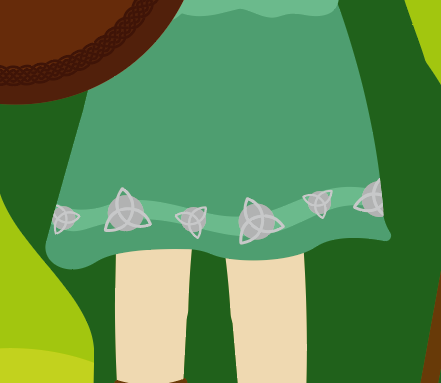
So at that stage I went back to the skirt design from the previous illustration. As with the Cú Chulainn illustration I wanted to include the symbol which was associated to that characters leader, which was in this case Queen Medb who wore the triquetra symbol on her cloak. As you can see from the examples below I tried to include the braiding which was also present in Medb's cloak but it felt too busy.


I eventually settled on this much simpler skirt design (without the braiding), it took a while refining to get the right level of opacity within the skirt symbols but I think the final gives a lot of depth. When I had finished the main design for the skirt, I felt like the skirt was looked as if it was just placed on the body and it needed a more solid connection to the torso. This is where I decided on the inclusion of a belt.


Next I moved on to accessories, as Cú Chulainn had 2 extras (hound and spear) I felt it was only right to keep that balance with Ferdia's design. So along with the inclusion of the spear I designed a shield. I based the shield design on shield designs from the same era and added inclusions again like the triquetra symbol to show his allegiance.


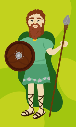
Below is the final Ferdia illustration, I feel it is a great counterpart illustration to Cú Chulainn, whilst also being strong on it's own.


Connaught Soldier
The last of the pairs illustrations I had to design was the Connaught and Ulster Soldier characters. As I'm a Connaught woman myself I started with Connaught. As these characters did not have specific visuals associated I had more free reign in how I wanted to design them. As many illustrations of characters in Irish mythological representations have quite distinctive beards and longer hair, I decided to include these elements in my design. As the character had such distinct facial hair I didn't think it was necessary to include as bushy eyebrows as in previous characters. In fact I think the face is more balanced because of this. Again as the Connaught soldier was under Medb's rule his character design features the shield with her symbol.


I briefly considered including a helmet element to his costume but after briefly testing I didn't like how it brought a lot of focus to the characters head and also took away some visuals of the face.


Colour choices on the soldier characters costumes were based on the colour associated with the leader they have an alliance with. For this reason the Connaught soldier main clothes will be blue to corresponds Medb's clothes (based on colour of the Connaught flag), and the Ulster soldier clothes will be red corresponding to Daire's clothes (based on the colour of the Ulster flag).
From there I moved on to the costumes, again I tried to see if the dress design would work now on a character that has a beard and more masculine presenting facial features. However after including the cloak to see how the outfit would look altogether I still wasn't pleased with how this looked so I reverted back to the skirt design.


From here I added the triquetra symbols again linking the character to the side of the story they are on.


Lastly, I added in the spear and shield elements to finish off the illustration.


Ulster Soldier
For the design of the Ulster character the only real large change I had to make was in the hair and facial features. Small changes were made to customise the character in terms of changing the symbols on the shield and skirt, and switching the clothes colours from blue to red. Below are some examples of trying to figure out the new hair and facial elements.
At first I was trying to implement a mustache for the character however it didn't seem to fit right in terms of context of the character. It made the character came off a little more French looking than I would like. After going through a bit more trial and error I returned to a shorter beard design.


These were so more iterations that I went through whilst getting to the final design, that is shown here on the right.


This is what the final design for the Ulster soldier is, I'm very happy with how the two characters interact when placed together. I made sure to keep both soldiers facial expressions to be neutral as the soldiers themselves are fighting on behalf of a cause. Unlike the Medb and Daire facial expressions which are very angry, showing the negative emotions that started the war.


Bull
Whilst the bull is the arguably the most important character in the deck, it was actually one of the illustrations that took the least amount of time to complete. Having the dog character already created gave me a better idea of how to present a bull character in this illustration style.
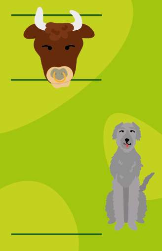
Before starting out I set up guides from the people characters to give me scale in creating the bull character. These lines give approximate levels for the top of the head, the shoulders and the end of the feet. This was very helpful in figuring out how to create the bull character to the same scale as the people characters as the bodily form of the bull is much different to the people.

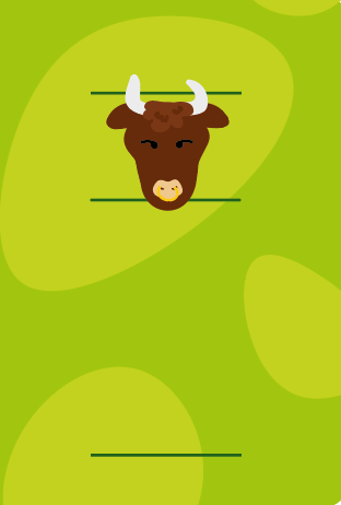

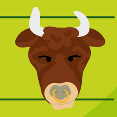
As with all the other characters I started designing from the head. Based on the design of the dog and reference images of bulls I was looking at it I developed the following design. In order to give more depth to the large areas of flat colour I included smaller organic shapes of a lighter colour to look like markings. To keep cohesive with the other illustrations, I utilised the same eye design that is used with the people characters.


From there I started work on the body. Similar to the design of the dog I illustrated a ruffled area around the neck to give more depth to the torso area. I put in the vague shape of the legs first before adding detail to look like hair. However I wasn't quite happy with how this looked as a whole, it looked like the bull was wearing ruffley pants and was not part of his actual body.


At this point I felt that the bull's body composition was off. It looked too much like a person. I decided to turn off my guides and find a reference image to work off. I had originally tried to find a front on photo image of a bull but there were very little images where the animal was not sideways on. However I was able to find this painting of the same posture that had the correct dimensions of a real bull. This image helped me in creating a more accurate representation for my bull illustration.

The trickiest part of this was creating and aligning the front and back legs. I wanted to show the legs all front on but it took a lot of moving around to make the legs look like seperate limbs as opposed to being a fluffy mass off the legs and body. I found that changing the colour of the back legs to be darker and adding a small area attached to the front legs worked to separate these areas.

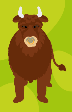


Final details included adding hooves and ruffles on the body and legs to give more depth to the large areas of flat colour.


This is the final illustration for the bull and above all of the illustrations it is the one that I'm most proud of and feel is the most successful. The bull works well as a stand alone which is very important as I will most likely be using it in key visuals of the deck such as on the box design.


Comments