Box Deck Design
- Isabel Greene

- May 10, 2021
- 3 min read
The basis of the box design was actually based on a design I had made when I was developing the design for the backs of the cards. So going into creating the box I kind of all already had a pretty good idea of how I wanted the box to look. Originally I had thought of having the triskele pattern and gradient wrap around to the sides and back of the box but realised that when I actually tested out that concept that it was really overpowering. It also gave off the impression that the bull head had been placed on as an after thought, which is of course not what I wanted as the bull is supposed to be the main focal point.


From there I decided that I would take the full gradient off the sides of the box as this was too distracting. With the green sides on the box there now felt like too much of a distinction between the sides of the box and the front. To connect the box more as whole I introduced a frame element to connect the green panels of the sides to the front panel. I think this is successful at giving the box more cohesion overall. I did elect to keep the gradient pieces on the small side flaps and large opening as a point of interest and so that everything would not feel so starkly green.


From there I moved on to the back of the box. I specifically wanted the back to include a small blurb about the game so that if someone picked it up and had no idea about the deck it could give them a bit of information about what the game was about. To hold the text, I employed this round cornered rectangle shape which I had used across my deck to remain cohesive with the rest of the designs.


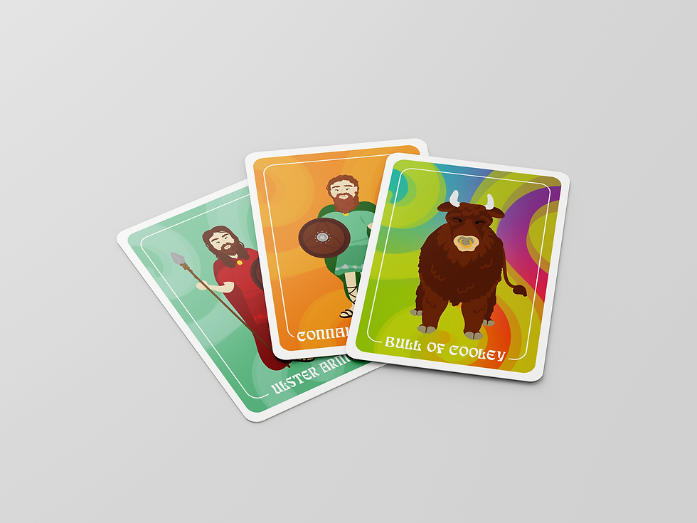
With having a bit of space left I wanted to play with including one of the character designs to further showcase the illustration style. I decided on including the Queen Medb character as she is the next most important character in the story and in the game.


After adding this I felt that the blank green sides of the deck seemed a bit plain in contrast to the rest of the box and wanted to include some more interest. During creation of my backgrounds I discovered a filter tool which creates interesting wave patterns. It was too much for the backgrounds of the cards, so I unfortunately couldn't use it but I felt that this could be a great use for it.
Lastly, I had a bit space at the bottom which I knew I wouldn't be able to easily fill with text so I decided that instead I would include an age rating on the cards. Due to some more complex game mechanics I have decided to set the rating at 8+ as I think children under this age may get confused with these mechanics.


This is the final design for the box, I'm really pleased with the final design. I think it shows a lot of the interesting elements of the cards and is quirky and fun. As the deck is so visually interesting I think it would definitely do a great job at catching the ye of my target audience.


Comments