Character Design Development
- Isabel Greene

- Apr 28, 2021
- 4 min read
Following on from my Queen Medb character, my next character to design was Daire - her counterpart in the game. In order to keep the illustrations cohesive for a start I copied and mirrored the Queen's face. This is also why I have been creating the Daire character beside Medb so that the designs remain consistent. From there I started editing different features to make his face more masculine and older looking.

Daire's and Medb's cloak colours are based on the colours associated with their respective provinces, Medb is the the Queen of Connaught and the Connaught flag is blue. Similarily, Daire is an Ulster nobleman, the colour of Ulster is red. Again the cloak shape is based on Medb's for cohesive design. I decided to utilise these triskele patterns which are used a lot in Celtic art. I had originally wanted to have Daire's cloak more open but after wrestling with trying to make the fabric look flowy I decided it looked better if instead they clothes underneath peak out a bit, this also makes Daire's posture and stature more noble, as opposed to sloppy.
In order to slightly mirror Medb's posture I added an out stretched fist to the figure. I like this pose I feel it gives a lot of connection between the characters. With this design if the 2 cards are put beside each other it looks as if they are interacting. I have planned the characters so that mirroring characters will be facing together and are at the same eye level. This creates a relationship between the characters even though they are on seperate cards. Although I like the out stretched arm element I'm not sure how well it will fit with the rest of the characters. I think I'm going to put this to my peers and get their opinions on it later in the week.
Queen Medb Cloak
After getting to this point with the I realised that Daire's cloak made him look far more important and regal than Medb's. With this in mind I decided to review my Queen Medb costume design and update her cloak.
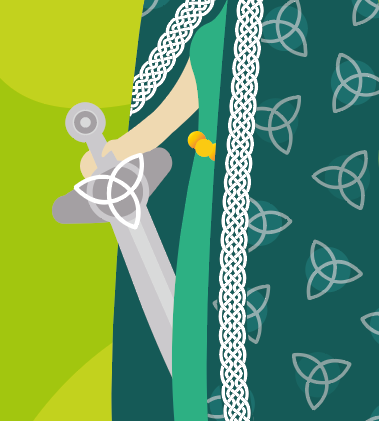
As I had used a triskele symbol on Daire's cloak, I decided it would only be fair to adorn Medb's cloak with a Celtic symbol as well. To start I had put the triskele symbol on Medb's cloak too, but it made the characters look like they were on the same side. So in order to show they were seperate I decided Medb needed a different symbol on hers. I put the triquetra symbol on her cloak but it didn't look as natural as Daire's. I then decreased the opacity of the symbols and felt that it looked much better.
Whilst I was upgrading her cloak, I also decided to refine her sword more. It started with adding the triquetra symbol to the sword to decorate the hilt and then added circular elements to the end of the hilt. I think this has really upgraded the design and feel these upgrades have made the 2 characters be more cohesive.
Cú Chulainn
After refining these 2 characters, I moved on to designing Cú Chulainn. As with the other characters my Cú Chulainn design is based off a number of visual representations I've seen of the character. Unlike my previous character

It took a couple of turns to figure out the hair style and prominent facial features I was going to use, some as you can see are more successful. For example, the version on the bottom left gives me musketeer vibes, top middle comes off as too feminine, top right reminds me of Shaggy. However, I feel the version I settled on (bottom right) seems like an accurate representation of Cú Chulainn in this style.
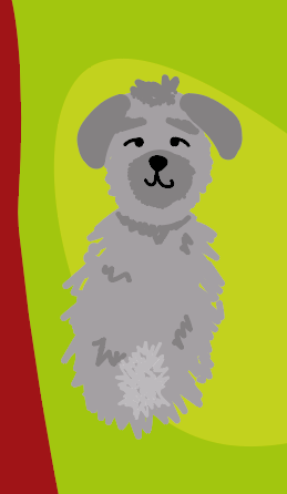
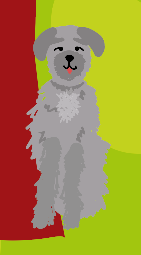
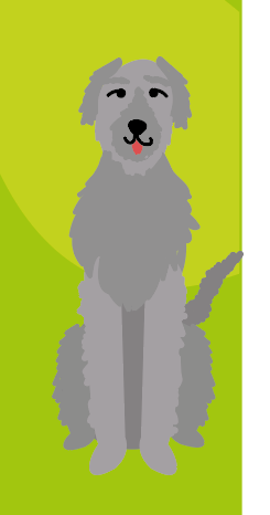
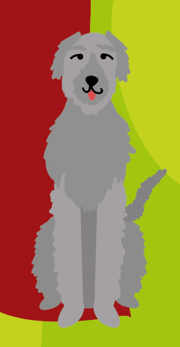
As I knew I didn't want to have the same cloak posture as the other characters, I was a bit apprehensive to start the Cú Chulainn costume design so I decided to take a slight detour and instead design the hound character for Cú Chulainn instead. I ended up having to make 2 different iterations of the hound in order to figure out the best way to represent the hound character in this style. I have lovingly dubbed them Woof 1 and Woof 2. I'm actually very happy with how the final design came out (shown bottom right), I feel this is a much better representation of the fluffy look of a greyhound that I was going for than the previous iterations.
With the hound finished, I went back to the character designs for Cú Chulainn. I wanted his form to be more front facing than the previous characters and also knew that I wanted him to be holding a spear as he is a warrior, which is why his arm is out to the side. I also made sure to give him more pronounced so that his chest would have dimension. As Cú Chulainn is on the side of Daire in the story, I matched the symbols on his skirt to that of Daire's cloak.
Over the rest of the week, I will be working on refining the costume and creating the feet and sandals for Cú Chulainn, as well as the other accessories.










Comments