Card Design Development
- Isabel Greene

- Apr 21, 2021
- 3 min read
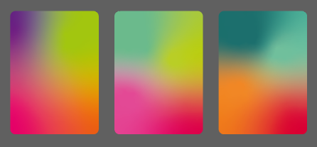
I started off by trying to design the backs of the cards. Using the gradients I had made based on some of the final colour palettes, I selected the first and applied it to the artboard. After trying out a couple of different type choices with the name "Bull of Cooley," I decided it was too boring looking and I wanted to add other elements or potentially take the name out altogether.


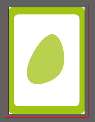
I then thought that I could create a repeat pattern of different elements and objects, and decided to do a quick iteration of what this might look like. I made a list of some objects which relate to the story and firstly created a shamrock icon to be included in this design. As a secondary element I designed a shield icon. I added the black bars shown on the cards to help me align the different icons. Obviously this wasn't anywhere close to being done but I kind of lost interest in this idea. Potentially, I could use the icons and repeat pattern idea but instead use the gradient background with white icons to give a cut out effect.

At this point, I was not feeling especially inspired on this part of the cards and decided right now it is more important to focus on the front of the cards and character illustrations. It would be a better idea to come back to the design of the back of the cards when I had a clearer vision for what the front of the cards and their illustrations would look like.
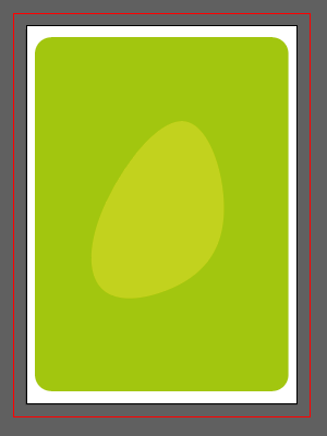
As I knew that I wanted to include green in the final colour palette, I started with that as a base colour for my cards. I started with a green lip on the cards but felt it looked a bit stark with the white background so I then inverted the colours. This white outline is also a common feature in standard card decks.
I want to incorporate the character names on each card and had thought that I could do this using a white strip at the bottom of the cards as shown below. However, I personally think this looks too much like a polaroid and the association is too retro for what I'm going for with the visuals.


Recently on TikTok, I had seen a designer talk about a tool they use to create organic blobs . Seeing as I am going for a modern look for the cards I decided it could be an interesting path to explore as a background pattern. Originally I only included one large blob to act as a focal point to centre the characters on. But then decided to add more to create more dimension and interest. Below are some rough sketches showing what the characters might look like against the background. This blob pattern may be replaced with a more detailed background in future but I'm enjoying playing with it at the minute to see how it evolves. These design iterations also show some of my exploration with name placement on the cards.


The above character sketches were created with the pen tool and I found I wasn't getting the organic feel and soft edges that I was going for. I was creating these in Illustrator so that they would be more easily edited and resized if necessary. However I decided to switch to the paintbrush tool along with the use of my Wacom tablet to get a more hand drawn feel. The illustrations below are the first iterations I created with these and I feel like they are a much better representation of the aesthetic I want to achieve.


I have been refining these and adding details such as curls in the hair. I am also playing with the idea of having the characters be larger on the cards and not necessarily include the whole figure. You can see this in the 3rd image (as I used the paintbrush tool this deformed the image slightly so I will be tracing the shapes with the pen tool if they are going to be enlarged). I think the larger images look better - but may not work if I end up including a more detailed background.


I have also been playing around with different types of typefaces for the names on the cards. I personally think that the first, fifth and sixth typefaces work the best- they are playful but also don't come off too childish, which is something important for me for the project.


I am slightly concerned that the current illustrations styles I have for the cards are too childish. So I'm going to reach out to my lecturers for feedback on this to see whether I need to refine or restart these - or if they are alright as is. Once I have this feedback I will be able to move forward with designing the rest of the characters.


Comments