Prototype Presentation Feedback & Illustration Style
- Isabel Greene

- Apr 15, 2021
- 2 min read
After coming back from the Easter break, the class presented our current prototypes (outputs) for feedback from peers and lecturers. I presented three different areas of my project. The first area was development, testing and selection of game concepts, the second area was colour exploration, and the third area was card design and character development.
Whilst presenting my peers left feedback on Padlet so that I could review and discuss their comments and suggestions on my work. Below is some of the feedback I received.


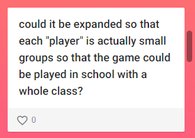
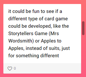


What I have gleaned from the feedback is that my peers liked the direction I went with for my project with the game. They pointed out that the game must be easily explained so that it can be best enjoyed. With this I think it may be helpful to include narrative based instructions to fully explain the story, this could be presented in a small booklet or using spare cards within the box.
As a part of this presentation I was able to ask questions of my peers to get feedback on different aspects of my projects. After my colour exploration, I had gotten it down to 3 different colour palettes, and I wanted to know which of the colour palettes they thought best represented a subtle sense of Irishness.


Illustration Style
Based on my presentation, my peers commented that they would like to see more examples of what the visual illustration style will look like. At this point I suggested that I could put together an updated moodboard for what illustration style I want to develop for the cards. The style is heavily based on flat colour with very subtly outlines (if any). Designers I have been looking at for illustrative inspiration are Fatti Burke, Brett Stenson, Owen Davey, Yoshi Yoshitani, and Ingela P. Arrhenius.
I will be trying to implement a slightly more limited colour palette, similar to that of Arrhenius's animal illustrations shown below (bottom middle). There are variations in the examples shown in terms of depth in composition and whilst I am creating my illustrations I will be exploring which side I will be leaning more towards. I think this will depend on which of these styles best suits the playing card format- which is quite small in area.

After presenting this I got a very positive response, my peers felt that this playful flat colour vector style will work well and be well suited to my audience. I then discussed with my lecturer how I will be creating my illustrations. I want to create the illustrations in Illustrator so that they will be vectors, and so more scalable and editable. I will be sketching these out manually and then bringing them digital to vectorize. My lecturer also recommended that before starting designing I should storyboard each card to get a idea of layout etc.


Comments