Card Character Backgrounds
- Isabel Greene

- May 6, 2021
- 5 min read
Over the course of creating my characters I have being mulling over the type of backgrounds that I wanted to create to compliment them best. Originally I had thought that I might include individual background imagery to give further context to each character. However, after thinking through the idea further I realised that not every character would have distinguishing elements to add that would make sense. Also considering the amount of time I have left for the project - it wouldn't be a smart move in terms of having the project be completed to as high a standard. With this in mind, I've decided I'll be creating some kind of interesting pattern - this will also aide in creating a more cohesive look to the deck overall. This will be great in connecting the four colour coded 'suits' also.
To start, I went to Pinterest for visual inspo. I find Pinterest can be a great tool in helping me to understand the visual direction I want to go with for a project by looking and collating similar visual sources. What I learnt from this interest exploration was that there are predominantly 2 different ways that card backgrounds will be formatted- either there will be a central image and then a block colour background (usually white), or the card visual will take up the whole space of the card with the background being very detailed. You can see some examples of this in my Pinterest board for this project and in a previous project board I created, both linked below-
The other thing I had gleaned from my research was that most designers had chosen to leave a white thin rim around the edges of their cards. I assume this was originally to leave a safe space for the designs in printing, however now is a common design feature of card decks. In fact I really like this feature and will be trying it out in my card designs.
Before I began designing I decided that when I was creating the cards, I would always include the character on top. I don't want to end up over designing the backgrounds and then needing to redesign once I added the characters back in. I started out wanting to try out creating some kind of Celtic border detail to compliment the Irish background of my project. Luckily, I have a book on Celtic decorative art and frames that I could reference for some of these Celtic frame designs. The book is called "Celtic Decorative Art: A Living Tradition" by Deborah O'Brien and if you have any interests in the Celts and their art I recommend it. It's really interesting with loads of great visuals. After having a flick through the book for inspiration, I really enjoyed the ornamental corner elements.


However after testing out the design above I felt that it came off as a bit more ornamental and delicate than the character designs and didn't really match with the vibe I am going with for the project. With this in mind I tried simplifying with a less ornate corner detail shown on the image above on the right. This frame idea is definitely just a jumping off point as a frame and not a full design for the backgrounds. I'm thinking this might be a nice addition to some other background elements.
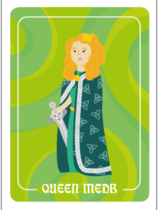
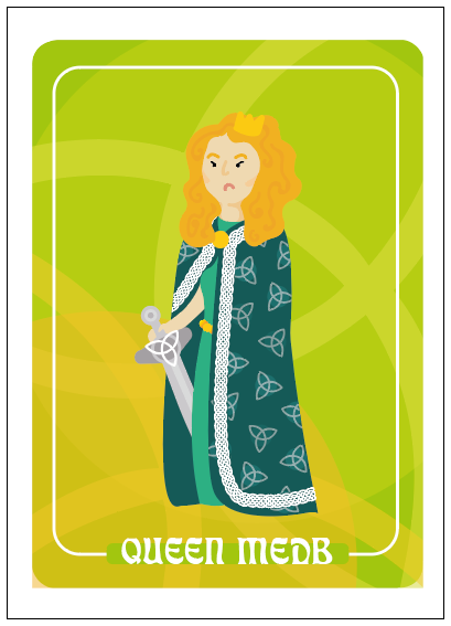
In these first two designs, I tried isolating the triquetra symbol from Queen Medb's cloak, this was to potentially act as a symbol to distinguish between the two sides of the story in the game. However, I wasn't really feeling this to be honest, it may potentially end up being another confusing element in game play. When it's not a crucial piece of game play I don't want to throw a spanner in the works and make things more confusing. The background should be an addition and not a distraction. I then tried implementing these chain semicircles as an attempt at a modern inclusion of the Celtic element but the seemed too detailed for the character designs and interacted with the character more than I would prefer.


From there I decided to try going with something a bit simpler so I made this wiggly line pattern to create subtle background movement. The lines were looking a bit too contrasted compared to the background so I lowered the opacity - this worked better as it didn't take the focus away from the character. On top of this I applied a thin frame outline, this was to bring focus to the characters but also as a setting for the character labels which I placed . I originally had the character names in lowercase but thought that the uppercase stood out better and held more weight. As the heights of the uppercase lettering are all the same, I think it also brings more balance to the composition.


I then moved on to playing with the labels and the frame and how they sat on the cards. I flipped the character label to the top of the card but it didn't sit right. I moved the name back down and tried to include the previous little Celtic elements on the corners. This is also when I decided to play with the scale of the characters on the cards. Previously, I felt that the characters seemed a bit overpowered by the backgrounds even though the backgrounds were simple. Scaling the character up definitely brings the focus back to the character.


With this more simpler format, I applied the four different colours I was intending on using to see how they worked. As I am replacing the card suits with colours, it is important that the coloured backgrounds look similar but also have a clear distinction. I think this works alright but I don't feel like the background wiggly lines are interesting enough. At this point, I decided I wanted to include a background that had more significance and meaning for my topic, so I moved on to a new direction.


The triskele symbol holds a lot of significance and meaning in Irish mythology and Celtic art, and I had already used it in the character designs so I thought it would be an apt symbol to use for the backgrounds. Immediately, this felt like it had a lot more power, especially with the overlapped lowered opacity design on the far right.


I played around with a number of different colours, opacities and layouts using the symbol but felt that the following designs were too powerful, and again took focus away from the character. I think the best of this concept are when the colours are quite close in tone, as its dynamic but not overpowering.


I also tried this with the triquetra symbol (also known as the trinity knot), however this did not have as much impact, I think this is as within the symbol itself I implemented differing opacity. I won't be continuing with these designs as they feel both too complicated and too simple.


I made these backgrounds as well as I still felt like I hadn't given the funky line enough time, but again these designs didn't measure up to my previous triskele designs.


Moving forward, I'm going to be further developing the triskele backgrounds, I'm not completely sure about the previous colour palette used and I also think working with closely toned colours with opacities can work really well but needs to be refined.


Comments